GPC dashboard
GPC Dashboard
Overview
The Global Privacy Control (GPC) Dashboard provides insights into the GPC activities of customers. Global Privacy Control (GPC) is a privacy standard that lets users automatically opt out of data sharing and sales on websites they visit. By enabling GPC in their browser or device, users send a "Do Not Sell or Share My Personal Information" signal. A configurable script placed on the client's website detects this signal and ensures compliance with privacy laws like GDPR and CCPA. The implementation can also be customized at different location levels to meet specific regulatory requirements.
Steps to view GPC dashboard:
- Sign into your Data Governance Tool account
- From the Main Screen of Data Governance Tool, click on DSA Request, present on the hamburger menu on the left of the screen.
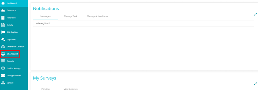
- From the DSAR page, click on GPC signals
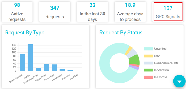
- The GPC Dashboard, also called the GPC Report page will now be opened
GPC Dashboard Page features
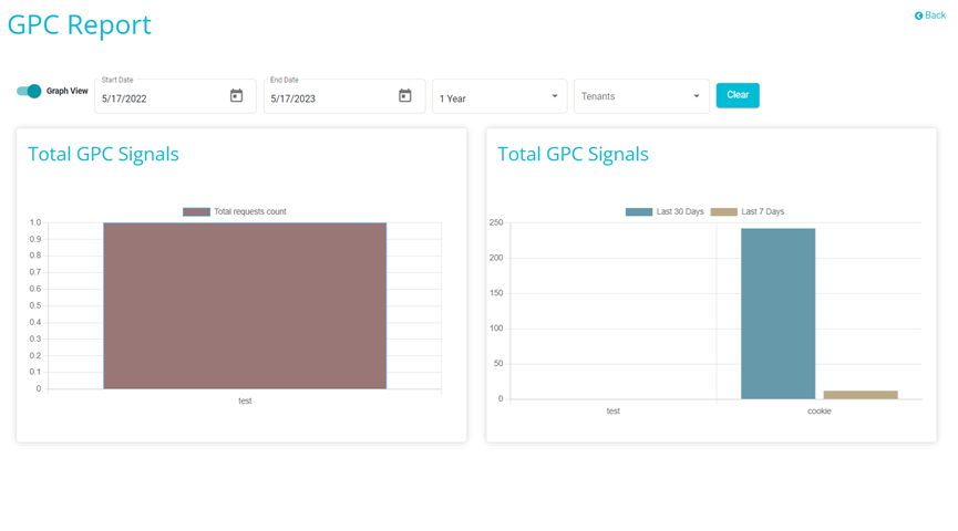
Table View
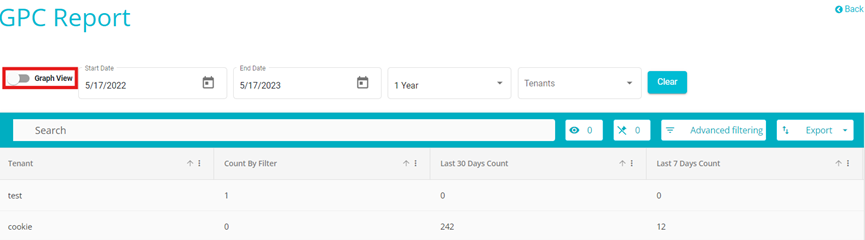
Users can toggle between a graphic representation of the GPC signals count details and a tabular representation of it.
- Note: Graph View is turned on by default
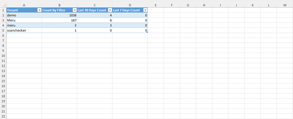
Click on the Export button to export the signal details in an Excel or CSV format based on requirement.
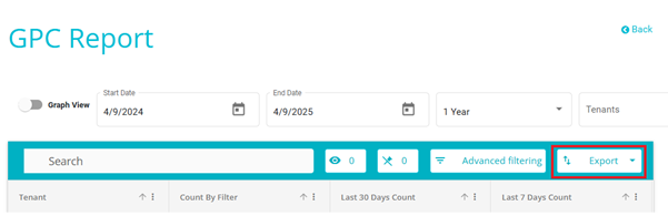
The below image shows how the exported file looks like.
Click on the toggle next to Graph view to go view the GPC signals details in the graphical representation
Start Date/End Date
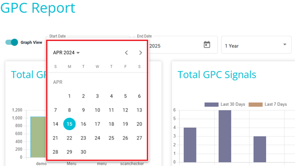
Check the signal count between the selected dates.
For example, if the start date selected is 17th of MAY 2022 and the end date selected is 17th of MAY 2023, the graph will show the total signals tracked between the 17th of MAY 2022 and the 17th of MAY 2023.
In other words, the number of users with GPC enabled who visited the tenant website between the 17th of MAY 2022 and the 17th of MAY 2023 will be provided here.
Duration
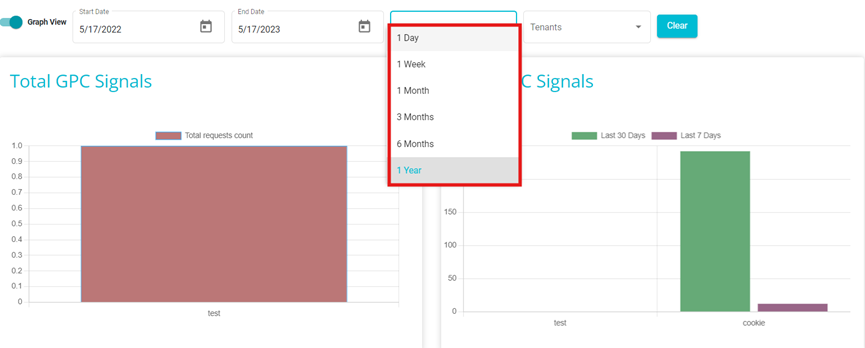
Here you can use this instead of providing the dates Manually for some predefined Durations.
- For example, by clicking on 1 year, the total signals tracked in the past 1 year will be displayed in the graphs.
Tenants
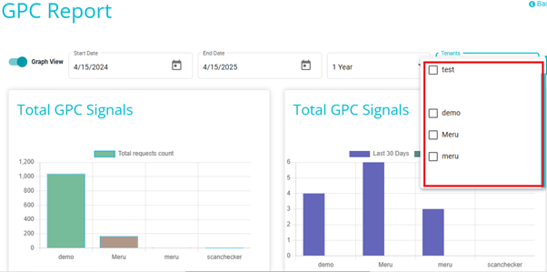
Here, you can select the tenant whose GPC signal count you wish to see.
The GPC dashboard contains report for all the Tenants present in the Environment.
- For example, if you have selected a specific tenant, the graphs will display the number of GPC signals tracked from that tenant website.
- In other words, it will show the number of users with GPC enabled who have visited the tenant website.
Clear
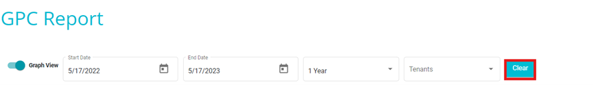
On clicking Clear, the selections will be removed, and the graphs will display the number of signals received in the past year for all tenants.
Total GPC Signals
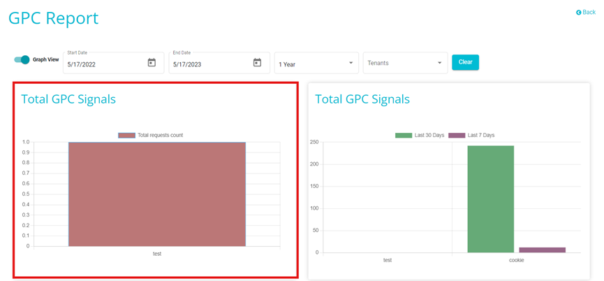
This graph displays the total number of signals tracked from each tenant with GPC enabled. In other words, it will display the total number of users with GPC enabled who visited the different tenants.
The GPC count increases when the GPC script on a client's websiteis activated. This happens when GPC is enabled and certain predefined conditions, such as geolocation, are met. The total count is then calculated across all tenants.
The GPC signal is captured by attaching it to an HTTP request made to a website. This signal communicates the user's choice to opt out of the sale or sharing of their data
When a browser or extension that supports GPC is used, it sends this signal to participating websites, which then respect the user's privacy preferences
The metrics on this graph will change depending on the filters added above.
- For example, If the duration "1 week" is selected and a specific tenant is chosen, the graph will display the number of users with GPC enabled who visited the tenant's website during that time.
Total GPC Signals -- last 30 days, last 7 days
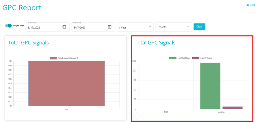
- This graph shows the number of requests received with GPC Signal enabled for last 30 days and 7 days in different tenants (this can't be filtered by the filers present above).
Device Type Graph
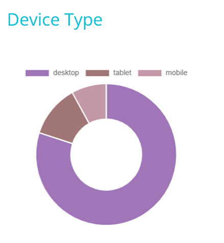
This graph shows the number of signals tracked from the different types of devices, such as desktops, mobiles and tablets.
The data on this graph will change according to the filters used above.
- For example, if the duration 1 week is selected then this graph will show all the signals tracked on the different devices over the past week only.
Browser graph
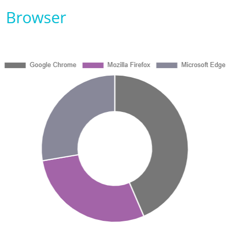
This graph shows the number of signals received from the different browsers such a Google Chrome, Mozilla Firefox and so forth.
The data on this graph will change according to the filters used above.
- For example, if the duration 1 week is selected then this graph will show all the signals tracked on the different browsers over the past week only.